Challenging Intuition with Data: People-Centric System Design
When making a decision, it’s often a balancing act between intuition and data. When we lack the data, we lean on our intuition. Hopefully, we later gain results that support our choices!
But there’s always a risk with this approach. The more you can close the gap between data and intuition, the better your solution is likely to be.
As part of a bespoke system overhaul with The University of Bedfordshire (which included an enterprise cms solution), we were asked to redesign their website. We all agreed it felt ‘dated’ and we were confident we could make it look ‘good’. But making a website look good doesn’t get to the heart of the problem.
People-centric design
People-centric design is really about improving the experience for everyone using a system. In this instance, it was about prospective students, university clearing and increasing enrolment.
The University of Bedfordshire had a set of logical, but intuitively-led design requests. We suggested aligning every design choice to a key business challenge - increasing open day and course applications.
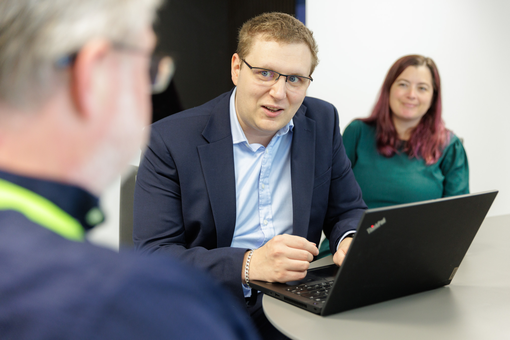
We took the decision to run an in-depth eye-tracking study to close the gap between intuition and data. Essentially we had prospective students completing tasks whilst having their behaviours and eyes tracked in a controlled environment.
Essentially there were three surprises:
1. The courses menu
To the left of the page was a large menu that allowed people to jump to the varying sections within a course. Technically, it was the shortest route to important information. It should have made webpage consumption more people-centric.
However the data from our study showed that it was never looked at and hardly used. It wasn’t doing the job it was designed for.
Based on the eye-tracking behaviours in the study, we instead made each section easier to consume whilst scrolling. Particularly impactful on mobile. It made navigation less cumbersome and more natural.
2. Homepage links
Homepage real estate was heavily sought after. Intuitively, it felt the most prominent place on the website. Although rational, it wasn’t reflected in the data.
In reality, prospective students already knew what courses they were looking for when arriving at beds.ac.uk. Someone looking for an English degree wouldn’t be encouraged to click an engineering link.
In fact the first thing everyone wanted to do was ‘search’. This would never have been spotted through website click data alone.
We therefore focused on dramatically improving the search functionality and prominently placing a large search box in the centre of the homepage. This made it super-simple to fulfil the primary objective of searching for courses!
3. Top menu
The top menu is where people were meant to find their desired courses. It contained every school and department, structured as the university was internally structured.
Over time, navigation had become overwhelming. By being aligned to internal structures and not user-behaviour, navigation could actually be counter intuitive.
We simplified this menu and structured it around search behaviours rather than internal structures. Although search was always the first action, the new menu system made contingent browsing simpler and more sticky. People stayed for longer.
Increasing enrollment
The University Of Bedfordshire has seen a 68% increase in enquiries and 40% increase in open day views on their website.
They’ve bucked the national trend. We of course can’t put this all down to us! - but we’re confident we’ve played a vital role in helping the university put its best foot forward with every student interaction.
We’re always keen to speak to people about their exciting ideas.
Please get in touch for a friendly, no obligation conversation with one of our engineers.


